What do you do when you are waiting for something or someone?
There was a burst mains water pipe in my area this afternoon so all thoughts of washing the kitchen floor after a day of building works flew out the door. I was also waiting for the Window Man to arrive to discuss the back patio sliding door.
Earlier this week I had an appointment with Door Man and we designed a contemporary front door to replace our original front door. This hard-working and functional door is on its last legs, having been subjected to over 50 years of British weather and multiple overhauls with fresh coats of paint.
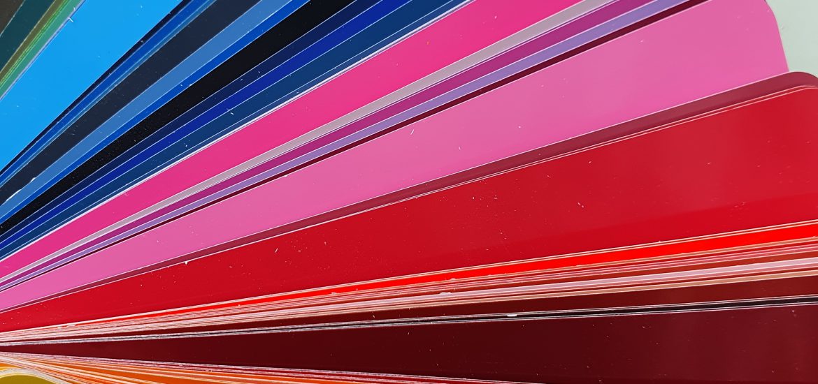
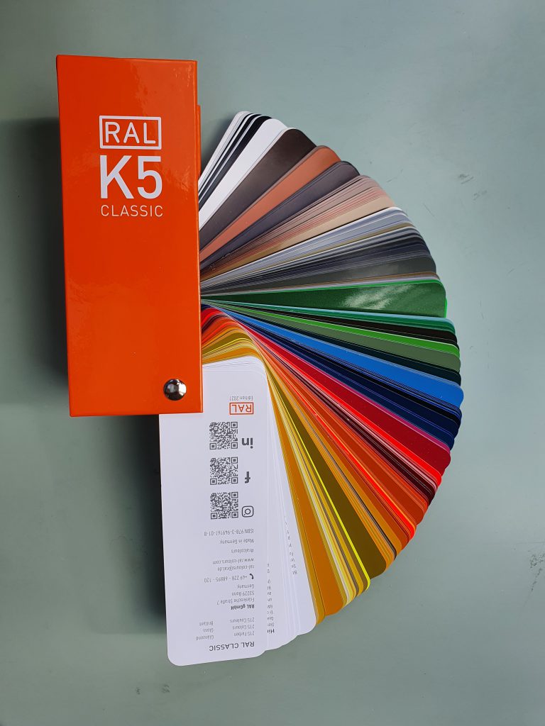
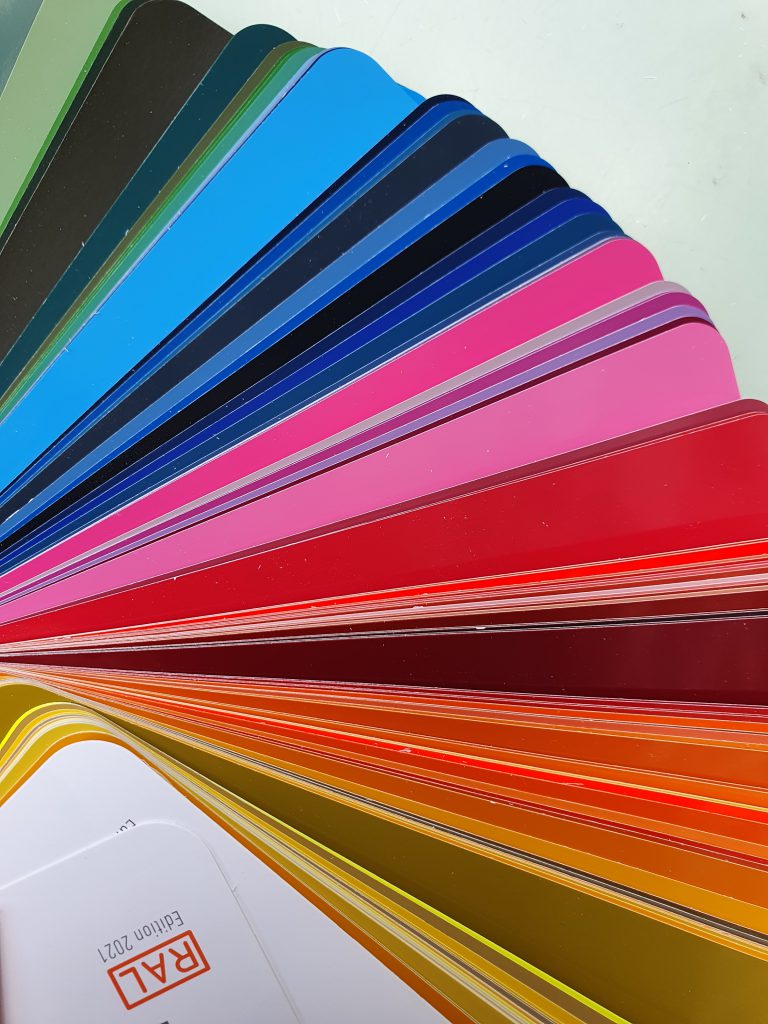
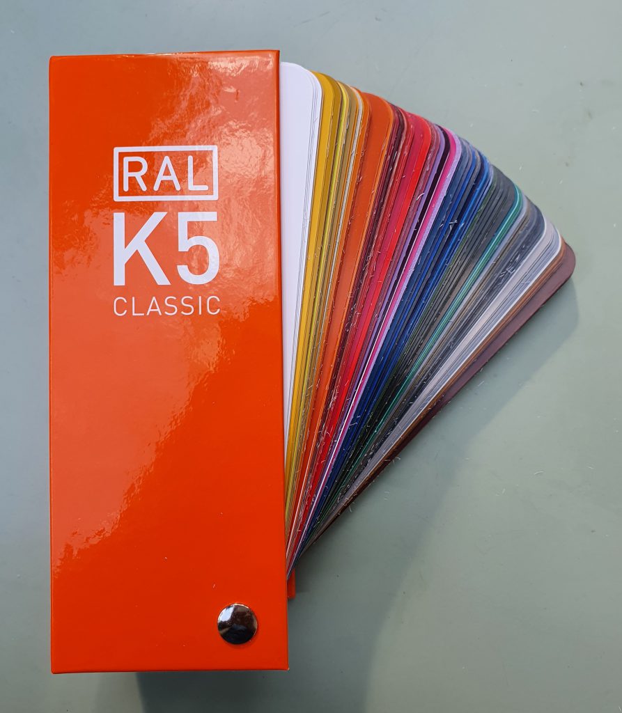
Whilst researching door colours I decided to buy an RAL colour chart. There is a short history of RAL colours here and this paint chart gives you an idea of the colours.
The subjects of waiting and colour reminded me of a game we used to play in primary school. There was a bare elongated dip in the small grassy area where we waited to be picked up after school. Dumping our school bags by the side, a few of us would gather to play the Crocodile Game. Truly, it was a favourite of mine.
It goes like this. One person would be nominated to be Crocodile. Crocodile would enter the dip (or river) and everyone else would line up along one side of the dip. The object of the game was to cross the river without being caught by Crocodile. In order to cross without harm, you would ask the following question: crocodile, crocodile, what colour do you want? Crocodile would name a colour and if you had that colour on you, for example on a hair clip, hair ribbon, handkerchief or watch, you would flash the item and Crocodile would grant you safe passage to the other side.
As it happens I really like colours and when I was Crocodile I never simply said Red or Blue or Green. My favourite possession in primary school was a box of Colleen colour pencils and I spent a lot of time drawing and colouring. But more than that I actually liked the wording on the colour pencils themselves. Words like emerald green, lemon yellow, Prussian blue, reddish brown, vermilion, khaki and magenta opened up a whole new world to me. It was simply magic to see so many colours and then have the vocabulary to describe each colour in detail.
So I really was a pain-in-the-neck Crocodile. I would ask for olive brown or leaf green or vandyke brown, and I was quite insistent on the exact match. When I fanned open the RAL colour chart I had such a feeling of happiness as it reminded me of my school days.
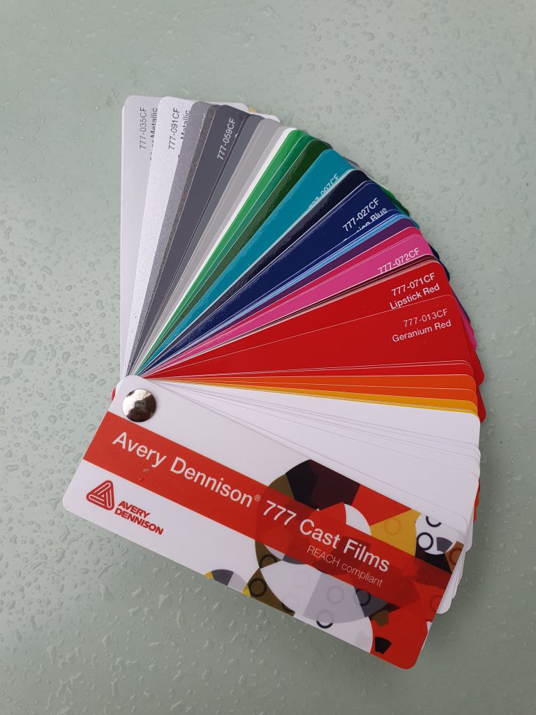
When Window Man arrived, he suggested RAL 7016 Anthracite Grey or 7011 Iron Grey for the sliding door frame. Then he passed me a colour chart for the film edging on the glass. Even more colour to lift a dull and wet day.
As for the front door colour, I half joked with my family that I want a door in my favourite accessory colour, which is orange. I am really particular about the colour orange and earlier this year I even sent back a handbag ordered online from Russell and Bromley because the colour they described as orange turned out to be more like terracotta. What I want is RAL 2017 Orange. I am no longer Crocodile mais la vie est toujours belle when you have the tools to describe specifically the colour you are looking for.
I am having to write less these days as the renovation of our ground floor is taking up a lot of my time and mental space. I hope to write a piece on the things to consider when commissioning a new kitchen/ dining room. We spend so much time in this part of the house that it merits some serious thought. I am grateful for the team at Wigmore Kitchens who have so competently and patiently dealt with my queries, starting with the difference between Blossom White and Polar White. I could talk about colour for a long time but really should stop now and continue another day.